Why are p-values uniformly distributed?

p-value
test statistic
cumulative distribution function
uniform distribution
probability integral transform

Graphical illustration and mathematical proof of the uniform distribution of p-values

Author

Daianna Gonzalez-Padilla

Published

February 7, 2025

⚠️ This page is under development.

Introduction

If you’ve ever tested a null hypothesis multiple times and computed a p-value for each test, you’ve almost certainly heard:

“Under the null hypothesis, p-values are uniformly distributed.”

In the practice, this statement is easy to graphically verify—simply plot the histogram of the p-values and examine the flatness of the distribution; any deviation toward the left (p-values closer to 0) suggests some tests don’t follow the null hypothesis. However, the reason why p-values spread evenly between 0 and 1 isn’t immediately apparent.

The uniformity of p-values is a direct consequence of how they’re defined and a theorem from probability theory called the probability integral transform. In this post, we’ll unpack exactly why p-values follow an uniform distribution, both graphically and mathematically.

What you’ll learn here

  • Understand how p-values are derived and how they relate to quantiles of a distribution.

  • Graphically demonstrate how p-values build an uniform distribution, when taking the lower and upper tails.

  • Mathematically demonstrate the uniformity of p-values according to xx theorem.

Defining the p-value

Let us begin by defining a test statistic. When you conduct a hypothesis test on a sample or dataset, you compute a quantity that measures the effect you are interested in (e.g. the difference in sample means across conditions). This effect estimate is often accompanied by a measure of uncertainty that depends on sample size and variability. In many statistical tests, the effect and its uncertainty are combined into what is known as a test statistic, but its specific construction depends on the properties of the data and the research question.

What is key about test statistics is that we know (or can approximate) their sampling distribution under the null hypothesis (e.g. when the effect is nonexistent). This allow us to compare our observed test statistic \(t_{ob}\) against the null distribution and assess how likely such a value would be if the null hypothesis were true. If you followed this reasoning, you’ve essentially grasped what a p-value is.

The p-value is the probability that, if you were to draw at random from such null distribution of test statistics, you would get one that is equal or more extreme (smaller or greater) than your observed test statistic \(t_{ob}\).

To visualize what a p-value represents, let’s simulate a null distribution of test statistics by randomly sampling 10,000 times from a standard normal distribution. Let \(T\) denote the test statistic, a random variable induced by the data, whose distribution under the null hypothesis we are simulating.

library(ggplot2)
library(latex2exp)

## Generate null distribution from N(0,1) 
set.seed(08112025)
null <- rnorm(10000, mean = 0, sd = 1)

## Density plot 
density <- dnorm(null, mean = 0, sd = 1) 
df <- data.frame(t = null, y = density)

ggplot(data = df, aes(x = t, ymin = 0, ymax = y)) +
  geom_ribbon(fill = "gray95", linewidth = 0.4) +
  theme_classic() +
  labs(x = "Test statistic (T)", 
       y = "Density") +
  geom_line(aes(y = y)) +
  coord_cartesian(ylim = c(0, max(df$y)+0.02), expand = F) +
  theme(plot.subtitle = element_text(size = 9, color = "gray30"), 
        axis.text = element_text(size = 9),
        axis.title.x = element_text(size = 10),
        axis.title.y = element_text(size = 10))

For a left-tailed test, the p-value corresponding to the observed test statistic \(t_{ob}\) is given by \(p_{_{left}}(t_{ob}) = P(T \leq t_{ob})\), i.e., the cumulative distribution function (CDF) of \(T\) evaluated at \(t_{ob}\), under the null hypothesis.

Show function for plotting p-value
library(dplyr)

plot_density_and_pval <- function(t_ob, tail){

  if(tail == "left") {
    
    df$to_fill <- as.character(df$t <= t_ob)
    pval <- signif(pnorm(t_ob, mean = 0, sd = 1, lower.tail = T), digits = 2)
    fill_lab = expression(T <= t[ob])
    p_lab_x_pos = min(df$t) + 1.2

  } else if(tail == "right") {
    
    df$to_fill <- as.character(df$t > t_ob)
    pval <- signif(pnorm(t_ob, mean = 0, sd = 1, lower.tail = F), digits = 2)
    fill_lab = expression(T > t[ob])
    p_lab_x_pos = -(min(df$t) + 1.2)

    # Two-tailed test
  } else {

    p_lab_x_pos = 0
    
    if(sum(df$t <= t_ob) < sum(df$t > t_ob)){
      
      t_right_tail <- quantile(df$t, 1-sum(df$t <= t_ob)/length(df$t))
      df$to_fill <- as.character(df$t <= t_ob | df$t >= t_right_tail)
      pval <- signif(2*pnorm(t_ob, mean = 0, sd = 1, lower.tail = T), digits = 2)
      fill_lab = expression(T <= t[ob] ~ "|" ~ T >= -t[ob])

    } else {
      
      t_left_tail <- quantile(df$t, sum(df$t > t_ob)/length(df$t))
      df$to_fill <- as.character(df$t > t_ob | df$t <= t_left_tail)
      pval <- signif(2*pnorm(t_ob, mean = 0, sd = 1, lower.tail = F), digits = 2)
      fill_lab = expression(T > t[ob] ~ "|" ~ T < -t[ob])
    }
  }

  df$to_fill <- factor(df$to_fill, levels = c("TRUE", "FALSE"))
  p <- ggplot(data = df, aes(x = t, ymin = 0, ymax = y,
                      fill = to_fill)) +
  geom_ribbon(linewidth = 0.4, color = "black") +
  scale_fill_manual(values = c("TRUE" = "orangered1", "FALSE" = "gray95")) +
  geom_segment(aes(x = t_ob, xend = t_ob, 
                   y = 0, yend = df[df$t == t_ob, "y"]),
               linewidth = 0.25, show.legend = F) +
  geom_text(aes(x = p_lab_x_pos, y = df[df$t == t_ob, "y"]/2), 
            inherit.aes = T, 
            label = paste0("italic(p) == ", pval),
            fontface = "plain", lineheight = 0.8,
            size = 2.5, show.legend = F, parse = TRUE) +
  theme_classic() +
  labs(x = "T", y = "Density",
       fill = fill_lab) +
  coord_cartesian(ylim = c(0, max(df$y)), expand = F) +
  annotate("rect", xmin = t_ob - 0.25, xmax = t_ob + 0.25,
           ymin = 0.022 - 0.015, ymax = 0.022 + 0.015,
           fill = "#F0FBC5", alpha = 0.85) +
  geom_text(aes(x = t_ob, y = 0.022, label =  expression(t[ob])), 
                 parse = T, size = 3.3, show.legend = F) +
  theme(axis.text = element_text(size = 9),
        axis.title.x = element_text(size = 10),
        axis.title.y = element_text(size = 10),
        legend.text = element_text(size = 7),
        legend.title = element_text(size = 10),
        legend.key.height = unit(0.5, "cm"),
        legend.key.width = unit(0.5, "cm"))
  
  if(tail == "both"){
    if(sum(df$t <= t_ob) < sum(df$t > t_ob)){
      tail_line <- t_right_tail
    } else{
      tail_line <- t_left_tail
    }
    p = p + geom_segment(aes(x = tail_line, xend = tail_line, 
                               y = 0, yend = dnorm(tail_line, mean = 0, sd = 1)),
                          linewidth = 0.25, show.legend = F) +
      annotate("rect", xmin = (-t_ob) - 0.25, xmax = (-t_ob) + 0.3,
           ymin = 0.022 - 0.015, ymax = 0.022 + 0.015,
           fill = "#F0FBC5", alpha = 0.85) +
      geom_text(aes(x = (-t_ob), y = 0.022, label =  expression(-t[ob])), 
                 parse = T, size = 3.3, show.legend = F)

  }
  p
}
plot_density_and_pval(t_ob = df$t[2], tail = "left")

For a right-tailed test the p-value for \(t_{ob}\) is given by \(p_{_{right}}(t_{ob}) = P(T >t_{ob}) = 1 - P(T \leq t_{ob})\), under the null hypothesis.

plot_density_and_pval(t_ob = df$t[2], tail = "right")

For a two-tailed test the p-value for \(t_{ob}\) is twice the smallest tail probability, i.e., \(p_{_{two}}(t_{ob}) = 2 \times min\{p_{_{left}}(t_{ob}),\ \ p_{_{right}}(t_{ob})\} =2 \times min\{P(T \leq t_{ob}),\ \ P(T >t_{ob})\}\) (if the null distribution is symmetric ⚠️).

plot_density_and_pval(t_ob = df$t[2], tail = "both")

The flatness 🥿 of the p-value histogram

Left-tailed p-values

To visualize why p-values are uniformly distributed, let’s consider all test statistics in the null distribution that fall below or at the 1st decile (\(t_{_{10\%}}\))—that is, the bottom 10%.

Note

Although deciles are used here for simplicity, the same reasoning applies to any proportion of the data.

For this purpose, we build three functions. The first annotates each test statistic \(t\) with the decile interval it falls into in the simulated null distribution; the second plots the density of \(T\) showing selected decile intervals, and the third plots the histogram of p-values for all test statistics contained in such intervals.

Show functions
library(grid)

## 1. Function to annotate decile interval for each test statistic t
annotate_decile_range <- function(decile){
    
  q = decile
  ## First annotate if each t is <= decile q
  decile_range <- if_else(df$t <= quantile(df$t, q), paste("leq", q), paste("g", q))
  
  while(q > 0.1){
    ## Then annotate if each t is between decile q-1 and q
    decile_range[which(df$t > quantile(df$t, q-0.1) & 
                         df$t <= quantile(df$t, q))] <- paste("g", q-0.1, ", leq", q)
    q = q - 0.1
  }
  decile_range[which(df$t <= quantile(df$t, 0.1))] <- "leq 0.1"
  
  df$decile_range <- decile_range
  
  return(df)
}
  

## 2. Function to color decile intervals in T density up to decile q
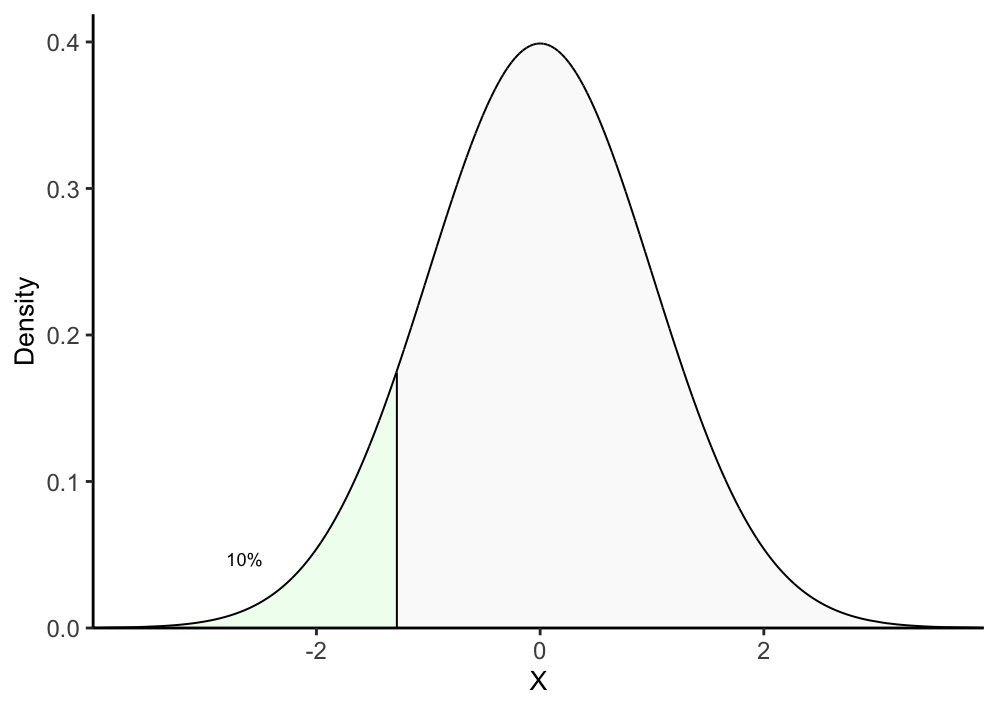
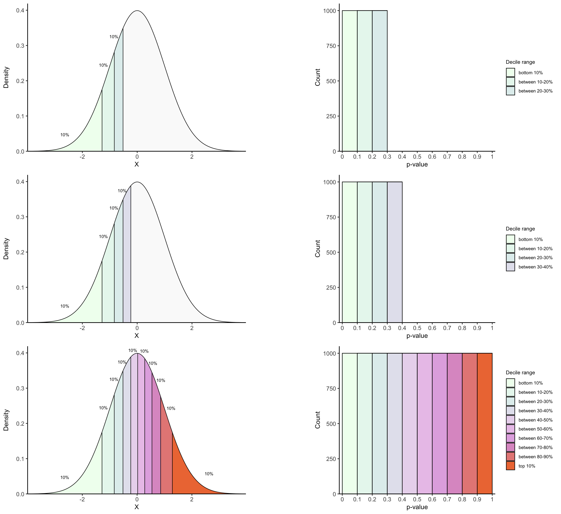
plot_density_decile <- function(decile){
  
  df <- annotate_decile_range(decile)
  
  ## Colors and alphas for decile ranges
  range_colors = c(colorRampPalette(c("honeydew1", "azure2", "thistle2","plum",
                                    "sienna2"))(10), "gray90")
  range_alphas = c(rep(1, 10), 0.2)
  names(range_colors) <- names(range_alphas) <- c("leq 0.1", 
                                   paste("g", seq(from = 0.1, to = 0.9, by = 0.1), ",", "leq", 
                                         seq(from = 0.1, to = 0.9, by = 0.1) + 0.1), 
                                   paste("g", decile))
  
  vlines <- vector()
  for(q in seq(from = 0.1, to = decile, by = 0.1)){
    
    ## For vertical lines in each decile 
    x = quantile(df$t, q)
    xend = quantile(df$t, q)
    y = 0
    yend = df[which.min(abs(df$t - x)), "y"]
    
    ## For annotating "10%" above each decile interval
    prior_x = quantile(df$t, q-0.1)
    prior_yend = df[which.min(abs(df$t - prior_x)), "y"]
    middle_x = prior_x + (x - prior_x)/2
    middle_y = prior_yend + (yend - prior_yend)/2
   
    if(q == 0.1){
      lab_x_pos = middle_x
      lab_y_pos = middle_y - 0.04
    }
    else if(q == 1){
      lab_x_pos = middle_x
      lab_y_pos = middle_y - 0.03
    }
    else if(q == 0.5){
      lab_x_pos = middle_x - 0.05
      lab_y_pos = middle_y + 0.014
    }
    else if(q == 0.6){
      lab_x_pos = middle_x + 0.12
      lab_y_pos = middle_y + 0.014
    }
    else{
      lab_x_pos = middle_x + (sign(x)*0.17)
      diff_y = abs((yend - prior_yend)/2)
      lab_y_pos = middle_y + (diff_y*0.33)
    }
    
    vlines <- rbind(vlines, c(q, x, xend, y, yend, lab_x_pos, lab_y_pos))
  }
    
  vlines <- as.data.frame(vlines)
  colnames(vlines) <- c("decile", "x", "xend", "y", "yend", "lab_x_pos", "lab_y_pos")
  
  
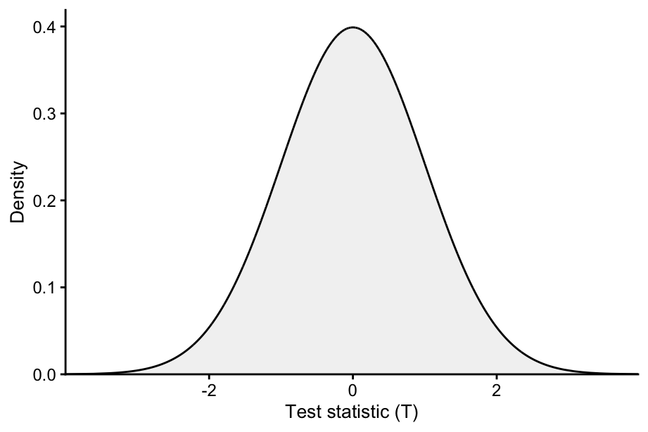
  plot <- ggplot(data = df, aes(x = t, ymin = 0, ymax = y, 
                        fill = decile_range,
                        alpha = decile_range)) +
  geom_ribbon(color = "black", linewidth = 0.35) +
  theme_classic() +
  scale_fill_manual(values = range_colors) +
  scale_alpha_manual(values = range_alphas) +
  labs(x = "T", 
       y = "Density") +
  geom_segment(data = vlines, inherit.aes = F,
               aes(x = x + 0.005, 
                   xend = xend + 0.005,
                   y = y, yend = yend), 
               linewidth = 0.35, show.legend = F) +
  geom_text(data = vlines, inherit.aes = F,
                aes(x = lab_x_pos, y = lab_y_pos), label ="10%", 
            size = 2.4, show.legend = F) +
  guides(fill = "none", alpha = "none") +
  coord_cartesian(ylim = c(0, max(df$y)+0.02), expand = F) +
  theme(axis.text = element_text(size = 9),
        legend.text = element_text(size = 7),
        legend.title = element_text(size =8),
        legend.key.height = unit(0.5, "cm"), 
        legend.key.width = unit(0.5, "cm"),
        axis.title.x = element_text(size = 10),
        axis.title.y = element_text(size = 10))
  
  ## To add labels for 1st and 2nd deciles
  if(decile == 0.1){
    plot <- plot + geom_text(aes(x = vlines[1,"x"], y = 0.015,
                                 label =  expression(t["10%"])), 
                             inherit.aes = F, parse = T, size = 3.3)
  }
  else if(decile == 0.2){
    plot <- plot + geom_text(aes(x = vlines[1,"x"]-0.07, y = 0.015,
                                 label =  expression(t["10%"])), 
                             inherit.aes = F, parse = T, size = 3.4) + 
                   geom_text(aes(x = vlines[2,"x"]+0.07, y = 0.015,
                                 label =  expression(t["20%"])), 
                             inherit.aes = F, parse = T, size = 3.4)
  }
  
  return(plot)
}


## 3. Function to plot pval histogram up to decile q
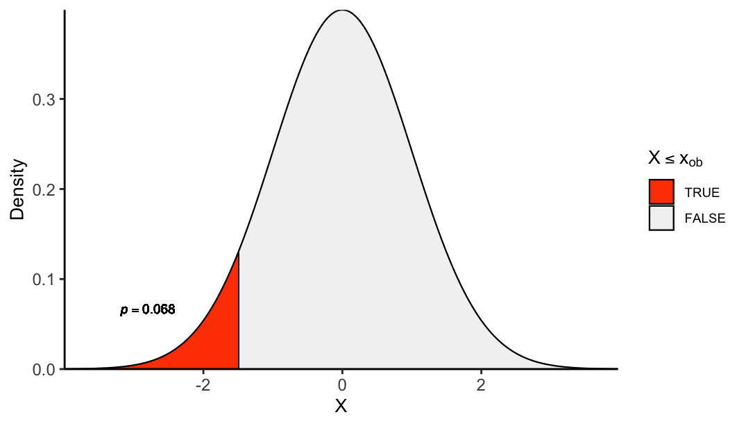
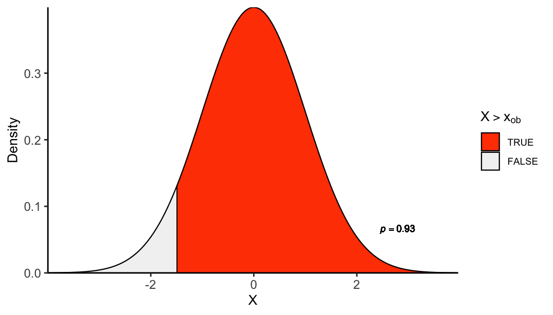
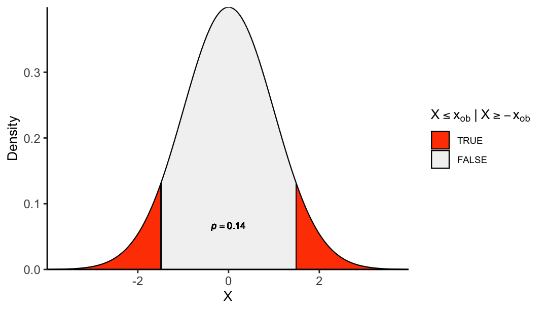
plot_pval_hist <- function(decile, tail){
  
  if(tail == "left"){
    tail_pvals <- "left_tailed_pval"
  } else if(tail == "right"){
    tail_pvals <- "right_tailed_pval"
  } else{
    tail_pvals <- "two_tailed_pval"
  }
  
  ## Colors and alphas for decile ranges
  range_colors = colorRampPalette(c("honeydew1", "azure2","thistle2","plum",
                                    "sienna2"))(10)
  names(range_colors) <- c("leq 0.1", 
                                   paste("g", seq(from = 0.1, to = 0.9, by = 0.1), ",", "leq", 
                                              seq(from = 0.1, to = 0.9, by = 0.1) + 0.1))

  decile_ranges_labs <- c("bottom 10%", "between 10-20%", "between 20-30%", "between 30-40%",
                          "between 40-50%", "between 50-60%", "between 60-70%",
                          "between 70-80%","between 80-90%", "top 10%")
  names(decile_ranges_labs) <- names(range_colors)

  df <- annotate_decile_range(decile)
  decile_ranges <- setdiff(unique(df$decile_range), paste("g", decile))

  data = subset(df, decile_range %in% decile_ranges)
  data$decile_range <- factor(data$decile_range, levels = names(decile_ranges_labs))
  
  if(tail == "both"){
    data$decile_range <- factor(data$decile_range, levels = rev(names(decile_ranges_labs)))
  }

  ## Histogram
  ggplot(data, aes(x = get(tail_pvals), fill = decile_range)) +
  geom_histogram(color="black", bins = 10, binwidth = 0.3, linewidth = 0.4,
                 breaks = seq(from = 0, to = 1, by = 0.1))  +
  theme_classic() +
  scale_fill_manual(values = range_colors, labels = decile_ranges_labs[decile_ranges]) +
  coord_cartesian(xlim = c(-0.02, 1.02), ylim = c(0, 1050), expand = F) +
  scale_x_continuous(breaks = seq(from = 0, to = 1, by = 0.1),
                     labels = seq(from = 0, to = 1, by = 0.1)) +
    labs(x = "p-value", y = "Count", fill = "Decile interval") +
    theme(axis.text = element_text(size = 9),
          legend.text = element_text(size = 7),
          legend.title = element_text(size =8),
          legend.key.height = unit(0.5, "cm"),
          legend.key.width = unit(0.5, "cm"),
          axis.title.x = element_text(size = 10),
          axis.title.y = element_text(size = 10))

}

Let’s look at the bottom 10% of test statistics under the null distribution.

plot_density_decile(0.1)

What is crucial to note is that, because these test statistics represent 10% of the data, the probability that a random draw from the null distribution will fall in this bottom region is 10%, i.e. \(P(T \leq t_{_{10\%}}) = p_{_{left}}(t_{_{10\%}}) = 0.1\), and this is true for any other quantile. Therefore, all statistics \(t\) in the first decile interval have probabilities smaller or equal to 0.1: \(p_{_{left}}(t) = P(T \le t) \le 0.1 \ \ \forall t \le t_{_{10\%}}\).

Below, we can visually confirm this by displaying the histogram of left-tailed p-values for all test statistics within the 1st decile interval.

## Left-tailed p-vals
df$left_tailed_pval <- sapply(df$t, function(t){table(df$t <= t)["TRUE"]/10000})

## Hist of pvals for bottom 10% 
plot_pval_hist(0.1, "left")

For the subsequent 10% of test statistics—those lying between the 1st and 2nd deciles \(t_{_{10\%}}\) and \(t_{_{20\%}}\)—their p-values lie in the interval (0.1, 0.2]: \(0.1 < p_{_{left}}(t) = P(T \le t) \le 0.2 \ \ \forall \ \ t_{_{10\%}} < t \le t_{_{20\%}}\).

library(cowplot)

p1 <- plot_density_decile(0.2)
p2 <- plot_pval_hist(0.2, "left")

plot_grid(p1, p2, align = "h")

Because every time we take the same percentage of test statistics lying between the \((q-1)\)th and \(q\)th deciles for \(q = 1,2,3, ..., 10\), and because their p-values lie in the interval \((\frac{q-1}{10}\), \(\frac{q}{10}]\), each bin in the p-value histogram contains the same proportion of statistics. As a result, the histogram is flat, reflecting the uniform distribution of p-values under the null hypothesis.

See it now, isn’t? If not, let’s progressively add more data—30%, 40%, 50%, and so on, until we reach the full distribution.

plot_grid(plot_density_decile(0.3), plot_pval_hist(0.3, "left"), 
          plot_density_decile(0.4), plot_pval_hist(0.4, "left"), 
          plot_density_decile(1), plot_pval_hist(1, "left"), align = "vh", ncol = 2, rel_widths = c(1, 0.8))

Mathematical demonstration

This observation can be formally demonstrated. The probability integral transform theorem states that, for \(T\), a continuous random variable, the random variable for its cumulative distribution function \(Y = F_T(T)\) (which returns left-tailed p-values), is uniformly distributed on \([0,1]\).

Proof: consider the cumulative distribution function of \(Y\), \(F_Y(y) = P(Y \leq y)\). Because \(P(Y \le y) = P(T \le F^{-1}_T(y)) = y\), then \(F_Y(y)=P(Y \le y) = y\) and \(Y\) is uniformly distributed.

Tip

💡 The key here is to note that the probability of observing a p-value less than or equal to \(y\) is the same as the probability of observing a test statistic less than or equal to the quantile \(F^{-1}_T(y)\) in the null distribution, corresponding to \(y\). That is, \(P(Y \le y) = P(T \le F^{-1}_T(y))\), which is, by definition, \(y\). See example in the code below.

## Pr(Y ≤ 0.456)
pr_Y = sum(df$left_tailed_pval <= 0.456) / length(df$left_tailed_pval) 
## Pr(T ≤ quantile for 0.456)
pr_T = sum(df$t <= quantile(df$t, 0.456)) / length(df$t) 
pr_Y == pr_T
[1] TRUE

Right-tailed p-values

For right-tailed p-values the pattern is mirrored: for every \(t \le t_{_{10\%}}\), because \(P(T \le t) \le 0.1\), then \(p_{_{right}}(t)=P(T>t) =1 - P(T \leq t) \ge 0.9\). For the second 10% of test statistics \(t_{_{10\%}} < t \leq t_{_{20\%}}\), \(0.1<P(T≤t)≤0.2\)\(0.8 \leq p_{_{right}}(t)=P(T>t) =1 - P(T \leq t) < 0.9\). In general, test statistics between the \((q-1)\)th and \(q\)th deciles have p-values in \([1-\frac{q}{10}\), \(1-\frac{q-1}{10})\).

## Right-tailed p-vals
df$right_tailed_pval <- sapply(df$t, function(t){table(df$t > t)["TRUE"]/10000})
df$right_tailed_pval <- replace(df$right_tailed_pval, which(is.na(df$right_tailed_pval)), 0)

plot_grid(plot_density_decile(0.1), plot_pval_hist(0.1, "right"), 
          plot_density_decile(1), plot_pval_hist(1, "right"), 
          align = "vh", ncol = 2, rel_widths = c(1, 0.8))

Mathematical demonstration

Proof: let \(Y_c = 1-Y\) denote the random variable for right-tailed p-values, which is the complement of the random variable for the CDF of \(T\). Consider the CDF of \(Y_c\), \(P(Y_c\leq y) = 1 - P(Y_c > y)\). Because \(P(Y_c > y) = P(T \leq F^{-1}_T(1-y)) = 1-y\), then \(P(Y_c\leq y) = 1 -(1-y)=y\) and both, \(Y\) and its complement \(Y_c\), follow a uniform distribution.

Tip

💡 The key point here is that right-tailed p-values greater than \(y\) correspond to the bottom \(1-y\) proportion of test statistics in the null distribution, so that \(P(Y_c > y) = P(T \leq F^{-1}_T(1-y))\), which, by definition, equals \(1-y\).

Two-tailed p-values

For data points within intervals of deciles \(q ∈ \{1,2,3,4,5\}\), their two-tailed p-values lie between \(\frac{q-1}{10}\times 2\) and \(\frac{q}{10}\times 2\), whereas for those above the 5th decile, p-values lie between \((1-\frac{q-1}{10})\times 2\) and \((1-\frac{q}{10})\times 2\).

## Right-tailed p-vals
# df$two_tailed_pval <- apply(df, 1, function(x){2*as.double(min(x["left_tailed_pval"], x["right_tailed_pval"]))})
# 
# ## Hist of pvals for bottom 10% data points
# p1 <- plot_pval_hist(0.1, "both") +  guides(fill = guide_legend(reverse = TRUE))
# p2 <- plot_pval_hist(0.2, "both") +  guides(fill = guide_legend(reverse = TRUE))
# p3 <- plot_pval_hist(0.6, "both") +  guides(fill = guide_legend(reverse = TRUE))
# p4 <- plot_pval_hist(1, "both") +  guides(fill = guide_legend(reverse = TRUE))
# 
# plot_grid(p1, p2, p3, p4, align = "h", ncol = 1)

Mathematical demonstration

Proof: let \(Y_l\) and \(Y_r\) be the random variables for two-tailed p-values for observations of \(X\) below and above the 5th decile, respectively (bottom and top half of previous histogram, respectively). Let \(Y_t\) be the random variable for two-tailed p-values across all observations (the complete histogram). The CDF of \(Y_t\) is \(P(Y_t \leq y) = \frac{P(Y_l \leq y)}{2} + \frac{P(Y_r \leq y)}{2} = P(Y \leq \frac{y}{2}) + P(Y_c \leq \frac{y}{2})\). Because \(Y\) and \(Y_c\) are uniformly distributed, the latter equals to \(\frac{y}{2} + \frac{y}{2}\) so \(P(Y_t \leq y) = y\) and is thus also uniformly distributed.

Ideas:

When p-values are uniformly distributed

  • Under the null hypothesis is true

  • The test statistic’s reference distribution is correct (e.g., you’re actually using the right t-distribution, χ² distribution, etc.)

  • No p-hacking or data snooping has been done

  • Continuous test statistic (ties complicate things)

In that ideal case,

P(p≤α)=α

for all α∈[0,1]α∈[0,1],
meaning the p-value follows a Uniform(0,1) distribution.


When they are not uniformly distributed

  • Null hypothesis is false → p-values are stochastically smaller (skewed toward 0)

  • Model assumptions are violated (wrong reference distribution, heteroscedasticity, etc.) → distribution can be distorted in unpredictable ways

  • Discrete test statistics (e.g., Fisher’s exact test) → distribution is “stepped” and not perfectly uniform

  • Multiple testing without correction → aggregated p-values no longer follow a simple uniform distribution

  • Selection bias / p-hacking → distribution can become heavily biased toward small values


✅ Bottom line:
P-values are theoretically Uniform(0,1) only under the null and correct modeling assumptions.
The reference distribution does matter — if it’s wrong, the uniformity breaks.

Conclusion

The cases where the p-values ar enot uniformly distributed have been discussed in. This is the formal basis of p-values being uniform: by definition they are CDF evaluations of observed statistics.